You ship the site. Everything looks great on your laptop. You open it on your phone — and the mobile menu is completely broken. Skills badges are showing as bullet points. Content overflows the screen. The CSS you deployed is correct in the file, but the browser is rendering something else entirely.
This happened to me after deploying my portfolio site, which was originally built with an AI coding agent. Instead of debugging everything manually, I used the same agent to diagnose and fix every issue — from CSS cascade conflicts to server-level cache corruption.
The setup
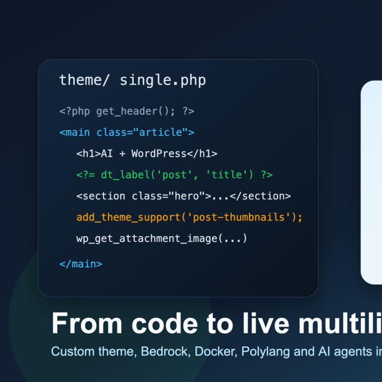
The site is a WordPress Bedrock portfolio running on Hostinger shared hosting with LiteSpeed cache. The theme was built mobile-first: desktop navigation hidden by default, mobile hamburger menu visible, responsive breakpoints at 992px and 767px.
After the initial deployment, everything worked in Chrome DevTools emulation. But when I opened the production site on a real iPhone in Safari — the layout was broken in multiple ways.
Bug 1: Desktop navigation visible on mobile
The CSS file had a clean mobile-first approach: .site-topbar__desktop-nav { display: none } at the base level, with display: flex only inside a @media (min-width: 992px) query. The file on disk was correct.
But the browser was ignoring it. The agent ran a JavaScript check on the live page and discovered that the served CSS had .home-landing__nav { display: flex } at the base level — a rule that should not exist. The production server was serving a different CSS than what was in the file.
Root cause: LiteSpeed’s UCSS (Unique CSS) optimization was stripping rules it considered “unused” and rewriting the CSS. The file on disk was 53,378 bytes, but the HTTP response was only 38,886 bytes. LiteSpeed was silently removing mobile navigation rules, responsive breakpoints, and skill badge styles.
Fix: Disabled LiteSpeed CSS optimization through WordPress admin. The agent also found a CSS cascade bug: component-level display: flex was overriding the mobile-first display: none. Removed explicit display from component rules and let the responsive media query handle it.
Bug 2: Portfolio skills as bullet points
On real mobile Safari, technology badges showed as a plain list with disc bullets instead of styled inline badges. The agent counted parsed CSS rules in the browser: only 250 out of 311 rules were loading.
Root cause: Same LiteSpeed UCSS stripping — removing entire blocks of CSS it deemed unnecessary.
Bug 3: Post content overflowing on mobile
Single blog posts were horizontally scrollable. WordPress Gutenberg was injecting inline width: 720px on figures. The CSS max-width: 72ch also exceeded the mobile viewport.
Fix: Added overflow: hidden to the article container, overrode Gutenberg widths with width: 100% !important, and changed to max-width: min(72ch, 100%). The hero grid was changed to mobile-first.
Bug 4: Color contrast failing WCAG
Lighthouse caught contrast failures. The “Trusted by” names used opacity: 0.55, resulting in 3.38:1 ratio (4.5:1 required).
Fix: Replaced opacity with solid #5f6673 (5.13:1), darkened accent from #b45a2e to #ad5528 (passes 4.5:1 against both white and light backgrounds).
What I learned
The most surprising issue was not in my code at all. The hosting provider’s optimization layer was corrupting the CSS. Using an AI agent had a clear advantage: it could simultaneously read the file on disk, fetch the HTTP response, inspect the browser’s parsed CSS rules, and calculate contrast ratios — all in the same conversation.
For anyone deploying on shared hosting with aggressive caching: always verify that what the browser receives matches what you deployed. Your code might be perfect — and the server might be rewriting it.